

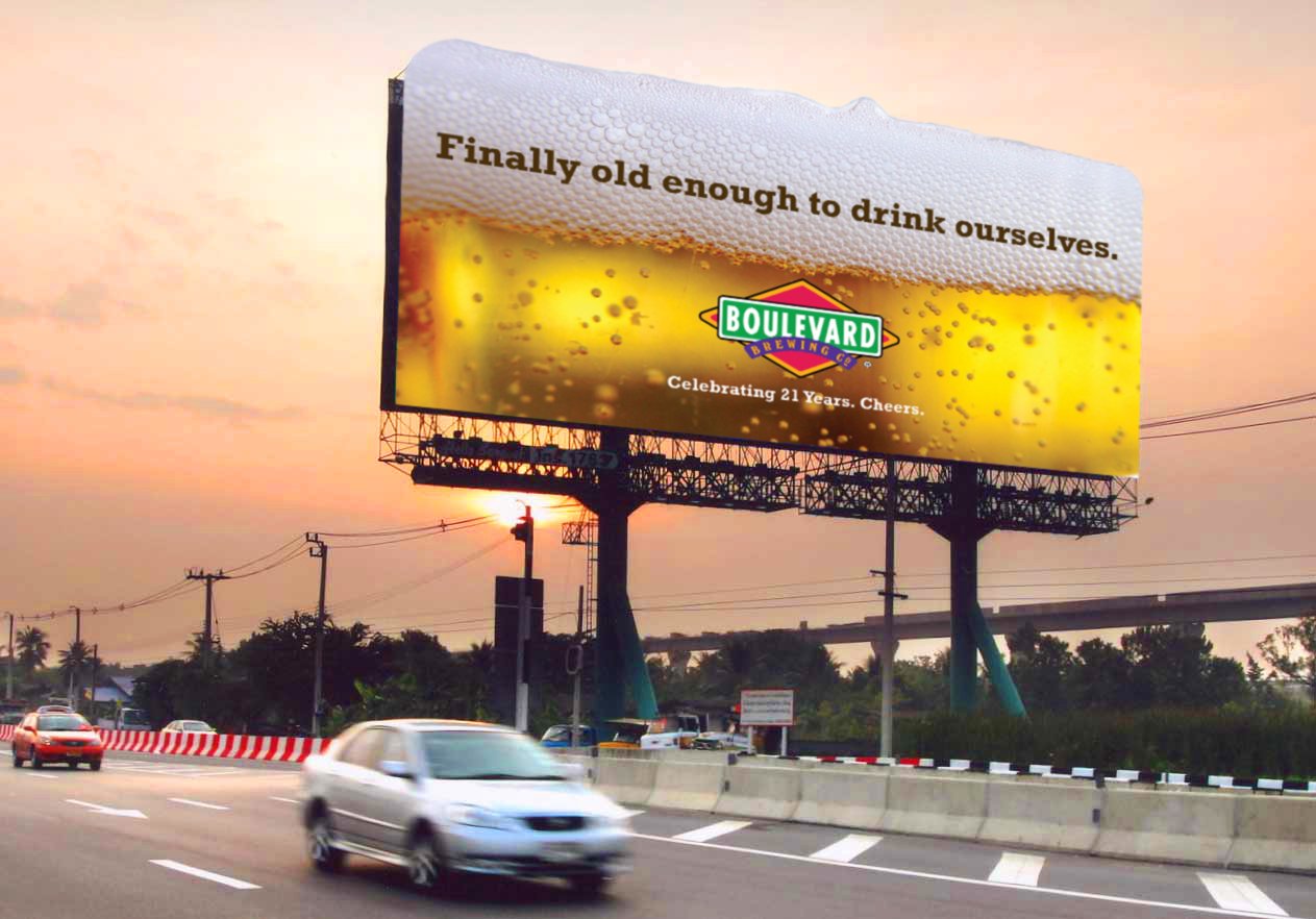
A driver at highway speed has roughly three seconds of usable viewing time on a billboard, and a portion of that is spent recognising that there is a billboard at all. Everything about billboard design follows from that constraint.
This article covers the practical rules: how large type must be, which color combinations survive glare, and the layout mistakes that make boards fail.
The three-second rule
Design for three seconds and you will produce a board that also works for the pedestrian and the stopped-traffic viewer. Design for ten and you will produce a board that fails everyone.
The practical test: show the artwork to someone for three seconds, take it away, and ask what the brand was and what it offered. If they cannot answer both, simplify.
Type size and legibility
Legibility scales with distance and speed. As a rough working guide, letters need roughly an inch of height for every ten feet of viewing distance, and highway boards are read from several hundred feet.
- Use heavy or bold weights, never light or condensed faces
- Set type in sentence case rather than all capitals for long words
- Keep letter spacing generous
- Limit the board to a headline plus a brand mark
- Never place type over a detailed area of the image
Color and contrast at speed
Black on yellow, white on dark blue, and black on white are the highest-legibility combinations in real conditions. Red on green, blue on black, and any pairing of similar values fail badly under sun glare or at dusk.
Remember the board will be seen in every lighting condition from bright noon to headlights, so choose combinations that hold up across all of them.
Layout and focal point
Give the board one focal point and let everything else support it. A common effective structure is an image occupying one third, a short headline in the middle, and the brand mark anchored at one side.
Avoid corner-to-corner compositions. Vignetting, mounting hardware, and viewing angle all eat the edges.
Common mistakes
Too much copy is the most frequent failure, followed by a logo too small to identify, a phone number nobody can memorise, and a website URL long enough to require a second look. Each of these is easy to catch in review and expensive to leave in place for an eight-week flight.
Digital billboards need a different discipline
Digital boards share a loop, so your message competes with a changing background. Static, high-contrast creative usually outperforms animated designs, and most operators restrict motion for safety reasons anyway.
Use the flexibility for message rotation across the flight rather than for movement within a single frame.
Frequently asked questions
How many words should a billboard have?
Seven or fewer, and five is better. Count the brand name in that total.
Should a billboard include a phone number?
Only for local services where the number is short and memorable. Otherwise use a simple URL.
Can I use a photograph?
Yes, if it has a single clear subject. Busy photographs turn into visual noise at distance.
Do QR codes belong on billboards?
No. Drivers cannot scan them safely and the distance makes it impractical.
Sources
- Out of Home Advertising Association of America
- Geopath OOH audience measurement
- Nielsen advertising research
- Association of National Advertisers
- Statista out of home advertising statistics
Related reading
Ready to apply these creative insights? MallAds.com brings more than 20 years of shopping-center and billboard experience to campaigns built around your market, audience, and budget.