

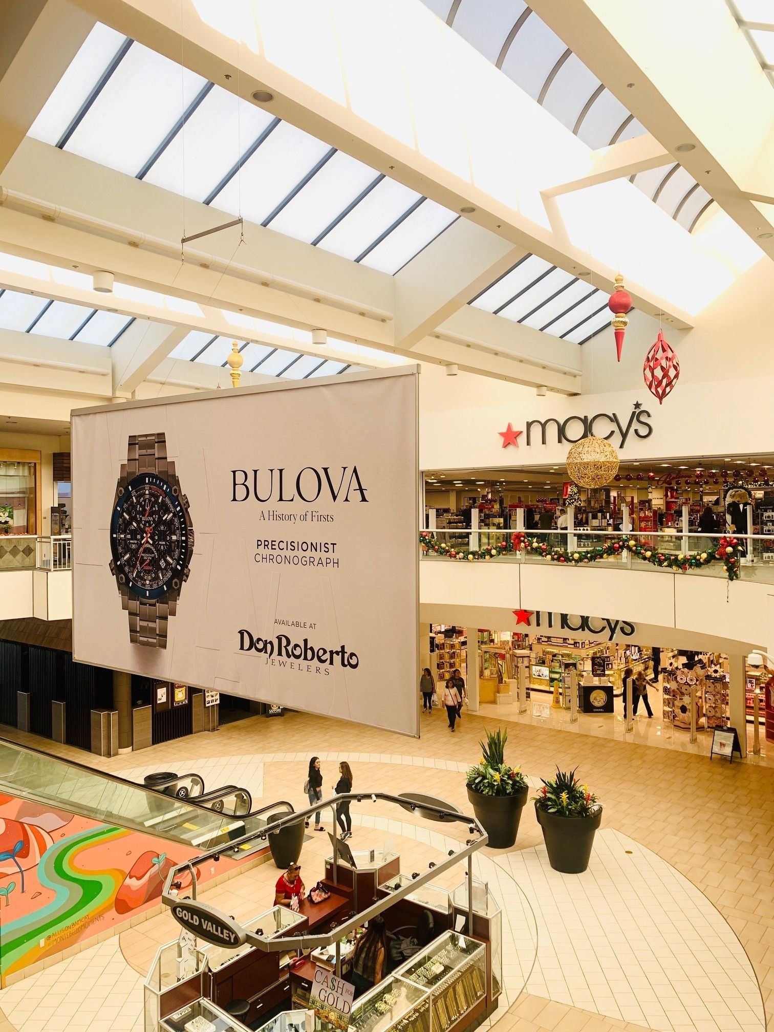
Placement decides who sees your advertisement. Creative decides whether seeing it does anything. In out-of-home, where the viewing window is measured in seconds, the gap between good and bad creative is larger than in almost any other medium.
These are the rules that hold up across formats, from a kiosk panel to a highway billboard.
Seven words or fewer
The single most reliable predictor of out-of-home effectiveness is word count. Every additional word reduces the chance the whole message is read. Seven is the working ceiling for anything viewed in motion, and fewer is usually better.
This is a discipline, not a limitation. Reducing a message to its essential claim usually improves it.
One idea, one action
A billboard cannot carry a product range. A kiosk cannot list eight services. Pick the single most important thing and let the rest live on the website the ad drives people to.
If a campaign genuinely needs to communicate several things, run several placements with different messages rather than one crowded placement.
Contrast beats beauty
Out-of-home is viewed under uncontrolled lighting, at odd angles, and often partially obstructed. High contrast between text and background survives all of that; subtle tonal design does not.
- Dark text on light ground or the reverse, never mid-tone on mid-tone
- Avoid thin typefaces and tight letter spacing
- Keep the brand mark clear of busy imagery
- Test the design in greyscale to confirm contrast
- View a printout from across a room before approving
Brand early and large
Research into advertising effectiveness repeatedly finds that weak branding is the most common cause of wasted spend. If a viewer remembers the joke but not the advertiser, the money is gone.
In out-of-home the fix is simple: make the logo bigger than feels comfortable and place it where the eye lands, not tucked into a corner.
Design for the actual viewing distance
A sky banner is read from eighty feet. A directory panel is read from three. Those require completely different designs, and reusing one artwork across both guarantees that at least one placement underperforms.
Ask for the viewing distance of each unit before design begins, and mock the creative at that distance.
Consistency across the campaign
Every placement should be recognisably the same campaign within half a second. A shared color, a shared layout, and a consistent brand position turn a set of individual advertisements into cumulative frequency, which is where out-of-home does its real work.
Frequently asked questions
Should I include a phone number?
Only in high-dwell placements. On anything viewed in motion, a memorable URL works better.
Is humor effective in OOH?
It can be, but only when the brand is unmistakable. Humor that overshadows the advertiser is a common failure.
How many creative versions should a campaign have?
Two or three variants of one idea maintain interest without fragmenting recognition.
Do photos or illustrations work better?
Either can work. What matters is a single clear focal point that reads instantly at distance.
Sources
- Out of Home Advertising Association of America
- Nielsen advertising research
- Harvard Business Review on advertising effectiveness
- Association of National Advertisers
- Think with Google consumer insights
Related reading
Ready to apply these creative insights? MallAds.com brings more than 20 years of shopping-center and billboard experience to campaigns built around your market, audience, and budget.